OTC brand Oluno breaks the existing pharmacy codes in the pharmacy and becomes a customer favorite

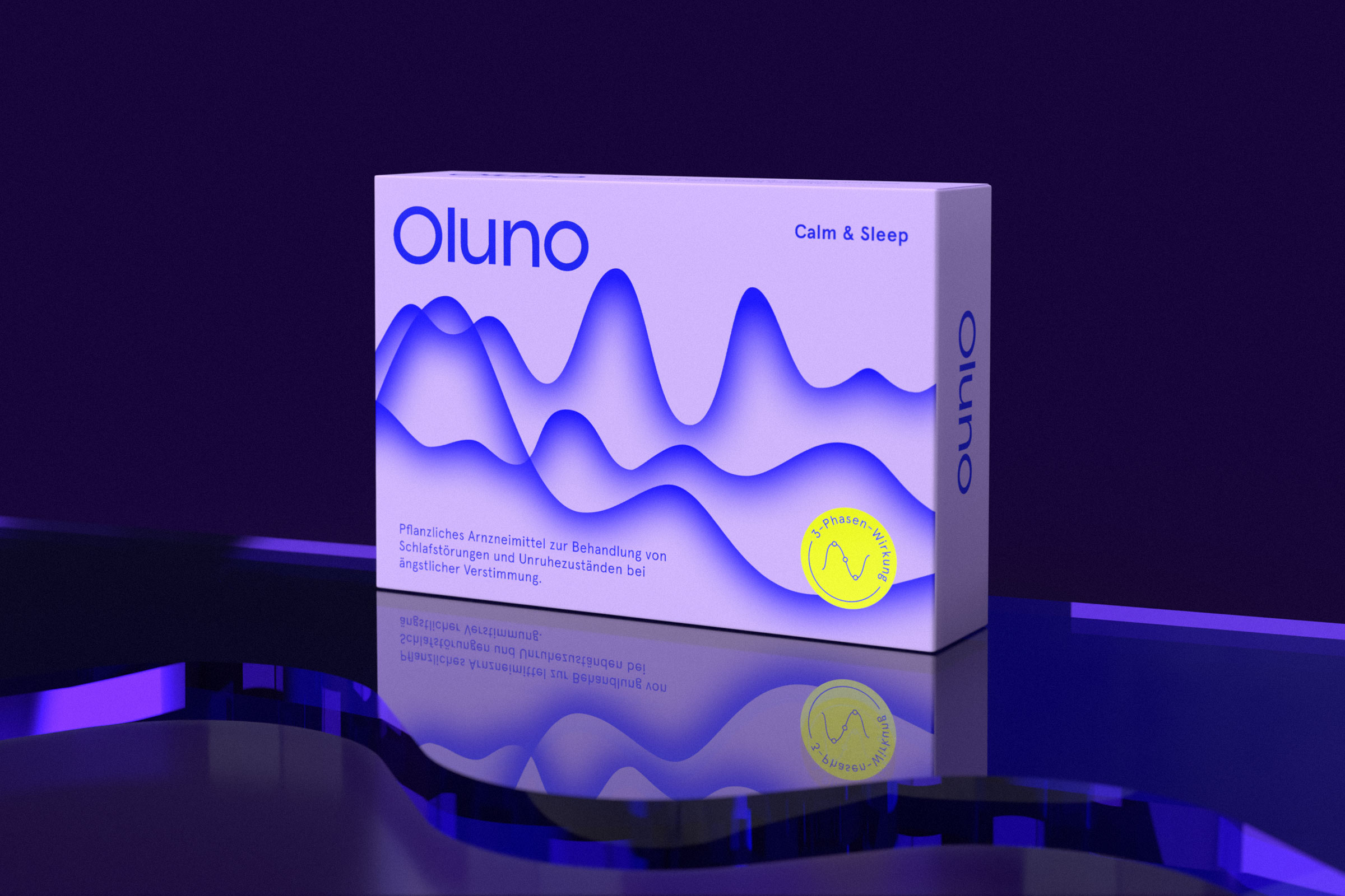
Oluno
Introducing Oluno – our distinctive name and brand identity crafted for an innovative nature-based sleep aid developed by a leading European healthcare company.
The name „Oluno“ derives its inspiration from the Hawaiian term „olu olu,“ signifying ease and lightness. The addition of „-no“ in Oluno connects to the notions of night (Noctem) and novelty (Nova).
This soothing and evocative quality of the name is harmoniously mirrored in our packaging design. Central to our design concept are sleep waves, representing the three distinct phases of sleep, which grace all our product applications. These sleep waves convey a sense of weightlessness and serene dreamscapes.
To further honor the name and stand out in the retail space, we’ve embraced warm colors, setting us apart from the typical blue and white palette of conventional sleeping pills. Our graphic design exudes efficiency while incorporating playful illustrations, reinforcing the natural ingredients that make Oluno exceptional.
With these elements in mind, let’s embark on a journey to experience peaceful and restful sleep, courtesy of Oluno.


„Oluno is the prime example of how OTC products don’t always have to be white, red or blue. We challenged expectations and conventions to develop a memorable and distinctive brand.“
Vera Henco – Managing Partner Design, KittoKatsu